


White label reporting or custom reports are here!
It was an often requested feature. So we’ve been busy checking out alternatives, assessed different offerings, calculated costs and even tried building some test reports using one of the more promising technologies.
But it it didn’t sit right. We needed something smarter!
The main caveat was that in this way we would build something that helped you only to report information available in SEO effect. But that is not how most of you work (and us too). A typical SEO uses several tools. Usually one — we hope SEO Effect — to steer the campaign and a couple of other tools to analyse, dig deeper, check assumptions etc. For example SEO Effect, Analytics and a tool for social media.
And for your clients, bosses, colleagues we want to provide useful dashboard, with some notes and reminders on how to interpret the data. So in short we wanted a tool that would help you to:
- integrate many data sources
- give you a free hand in what to report
- allow you to add comments
- facilitate white labeling
- update itself automatically
- and all this preferably dirt cheap
We found it (right under our noses) and though not perfect, it checks all the right boxes: Google sheets.

So how do these white label reports work?
In a Google spreadsheet you can import a csv, xml, json or things like that from any web address. You can manipulate that data to your heart’s content (duh, it’s a spreadsheet!), and then present the result with pretty graphs, colours and custom text. So far so good!
We’ve set up a couple of HTML feeds with a CSV that plays nice with Google sheets. We’ll be adding more with each update.
And it gets even better when looking at Analytics. There is an add-on for Google Analytics that you can use and that has a world of options, allowing you to report exactly what you want to show.
Pitfalls and (temporary?) limitations
Is it all hunky dory than? Nope! There are some pitfalls worth mentioning.
Just like in the custom reports in Analytics, you can mix metrics and dimensions that should not be mixed: For example mixing sessions, users and pages can lead to reports claiming sessions per users lower than 1 (which would be weird!).
What works nicely is sharing a report’s URL with your client or boss and make the report update itself daily. A bit so-so are PDF exports and using images. It kinda works but for PDFs a page-break function is sorely missed and images need a bit of room because they tend to move around more then you’d expect.
Google sheets has a nice in-cell spark line function, but that does not translate well to a webpage or PDF. (Yet?)
Finally: setting this up is best done in Chrome. We took it to the max with many rows of data and that brought Safari to its knees. Chrome faired slightly better and also behaved more stable while creating layouts. So use that browser to set up. Test the result in other browsers.
But if once you learn to avoid those pitfalls you’ll have a pretty powerful reporting tool at your disposal! We got some ‘wows’ from launching customers.
Why text is so important in a dashboard / report
A bit of a side line but bare with me.
When you communicate statistics with people not totally familiar with Google, SEO, Analytics etc, the half-life of them-remembering-what-you-explained tends to rocket to the 5 minute mark. Glazing eyes or a sudden interest in smartphone messages are solid makers telling you the boundary of what people can adsorb has been hit. That totally contradicts with how important it is to understand the meaning of the data in a report. If they ever are going to base their business decisions on your data, they do need to get it. Right?
Most of us have met some client stating: “Just show me how many visitors I’m getting” and find that person happy with any line starting bottom left and ending top right. But we also know that’s a temporary situation and we’re not really helping his or her business.
You should be able to give that kind of superficial data (like number of visitors) and give a client a segmented view with an explanation why that matters to them. It helps you to gradually educate your audience. And to make sure they still ‘get it’ 10 minutes later, your explanation has to be in your report, right next to the data. Back on topic: this white label solution allows you to do just that!
Get started!
A step by step instruction on how we like to do it. There is plenty of room to be creative and take different routes. Just try and enjoy! But if you want the template in this example to work, please follow the instructions.
Your first white label report for an SEO Effect campaign


- Login to your Google account preferably with a Chrome browser. For example to Google Drive.
- Open this template. It is a read only template.
- Note that this sheet contains a number of tabs: from ‘report’ to rankings.
- The first tab: ‘reports’ is the one that you’ll eventually share with your clients.
- Choose: File > Make a copy in the sheet menu to get a copy with full access.
- Use the links from this page (please log-in first) to get the links for Rank data or Crawl error data.
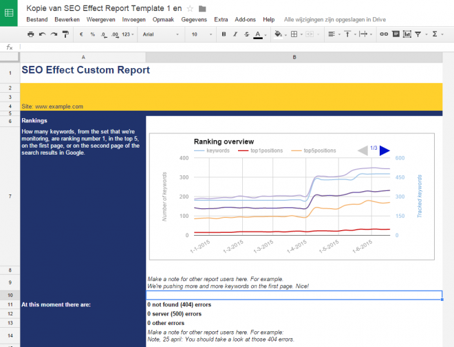
- Say you copied the rank data link. Now go to the Rankings tab, pick cell A1 and paste the URL from the previous step. Then select cell A2 and type: “=IMPORTDATA(A1)”
- You can do the same thing for the Crawl errors sheet: kopie the URL from the field labelled ‘Crawl errors”.

- Choose “Add-ons” to add this add-on. Then a dialog will pop up asking you to grant Google sheets access to your Google Analytics data.
- Then, again in de sheet menu, go to Add-ons > Google Analytics > Create new report
- Fill the fields as shown.
- Store the settings by clicking “Create Report”.
- Then press “Run reports” in the “Add-on” > “Google Analytics” menu. In the sheet, the data will be added to the “Sessions and Bounces” tab.
- Please note: by default, data is collected over the last 7 days. In the tab ‘Report configuration’ you can change this in the filed next to “Last N days” or by choosing a ‘Start date’ and an ‘End date’.

Now open the “Report” tab and you’ll have a simple example of a dashboard that contains data from two sources: SEO Effect and Analytics.
Changing the look and feel of your white label report
Of course you can use the layout function of Google sheets to change the look and feel to match your company or your client’s company (or give a nice Christmas vibe if it is that time of the year). Whatever feels right!
- Go to the first tab (reports) in your Google sheet and change the text in cel A1 to match your company or even ad a logo.
- Change the name of the template to something that you can easily adapt, like SEO report {client} {your company name}.
- Change the colours to match the desired style.
- Safe the report as your own template for future use
Keeping your data fresh!
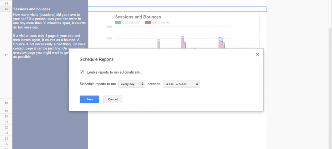
You can have the shared reports update automatically. Do this to set that up:
- Go to Add-ons > Google Analytics > Schedule reports, and click on Enable reports to run automatically.
- Data form both Google and SEO effect will be refreshed, als for users just viewing the web-view of the report tab (see below on how to set that up).

Publish your white label report
- Go to File > Publish on the internet and select the Report tab form the pick list.
- If required you can also share other tabs like ‘Crawl errors’.
- Test the link in other browsers to see if everything is OK. Don’t forget the document title and the website URL in cell A4.
- Share the link with your client or colleague
- You can stop sharing a report by choosing File > Publish on the internet > Stop publishing.
Some more things you might want to know.
- The width of the template is not random. It fits nicely on an iPad’s screen.
- Be careful on how you share the report tab. Don’t accidentally share the whole sheet unless you really want to. Use the File > Publish on internet option and select the Report tab. Test the link in another browser to make sure.
- In case you run into problems with the Google sheet, try to set sheet to ‘US’.
- To add more Google analytics reports in the sheet report setting (or by again choosing Add-ons > Google Analytics > Create new report), after each change run the reports again. To make the new or changed date visible on the report tab, choose a free cel (make it bigger if required) and add for example a new diagram.
- If you want to change the source of the data:
- In SEO Effect, go to the proper campaign and copy the URL again from the “White label reporting” tab.
- For Google Analytics, change the GA ID and re-run the reports.